Charts that convince everyone (Data column)



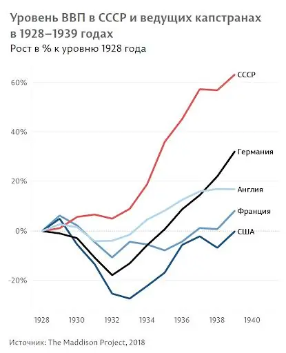
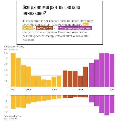
I read an interesting and short book by Alexander Bogachev, one of the leading Russian experts in data visualization, infographics and data journalism. According to the author, this is the first book on the effective presentation of data from a Russian-speaking author. It includes eight chapters and a bunch of graphs and diagrams to demonstrate the author’s thoughts visually. If you simplify the scheme, the author says Understanding your goal and audience depends on the message that we want to broadcast in them and its format. Preparing data for work is often the most resource-intensive activity Choosing the right type of graph or diagram - the book gives the main types of diagrams, and also describes their pros and cons Competent design of graphs for maximum impact - the author shows on examples how to improve visualizations by steps Recognition of manipulation of statistics
The book is useful. For everyone involved in visualizing information to learn how to do it better
- as well as managers who want to learn how to distinguish visualizations made quickly and without a drop of thought from those where people have worked and formulated a message and confirmed it with data visualization.
#Design #Data #Visual #Metrics